by Paul Uglum, president, Uglum Consulting, LLC
One of the primary purposes of decorating processes is to impart color to the object being decorated. Color is used to create beauty, to increase perceived value, to convey information and to define brand character. Color is only one aspect of a part’s appearance. Appearance is a combination of color, gloss, shape, geometry and the environment surrounding an object. Although only one facet of appearance, color is critical to achieving a desired outcome and must be understood and controlled.
Color often is misunderstood, surprisingly difficult to communicate and hard to get right. For such a key component of appearance, it is unfortunate that not enough people understand what constitutes color, how to communicate it and, most importantly, how to manage color in production.
Color is a perception of the different wavelengths of radiation in the visible band of the electromagnetic spectrum. Color comes from the light the eye receives and the way the brain interprets it. In order to have color, there must be a light source, an object to reflect the light and an observer (either human or instrument). If any of the three are missing, there is no observed color. When it comes to daylight, if all light is reflected, the color is white; if no light is reflected, the color is black; and if some light is reflected (and the rest absorbed), the color that is reflected is the observed color of the object.
Language of color
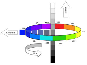
A good starting point is to define the language of color. Munsell developed a description of color in the early 1900s. He described colors in terms of hue, value and chroma rather than by unique color names in use at the time. Hue is the term for the continuum of colors around the color wheel (red, yellow, blue, etc.). Value is how light or dark the color is and chroma is a measure of how far away the color is of a neutral/gray (Figure 1).
When describing color, two color systems are in common use. These color spaces exist to give us a way to communicate color and color differences.
They are the CIE L*C*h0 color space and the CIELAB color space. In the CIE L*C*h0 the colors are plotted in color space where the L* value is the dark to light (0-100), C* is neutral to most chromatic (0-80) and h0 is the color angle (0°-360°). The CIELAB color space is based on the opposition theory of color perception. The L* is still the same and defines dark to light with the ideal black having a value of 0 and the ideal white having a value of 100.
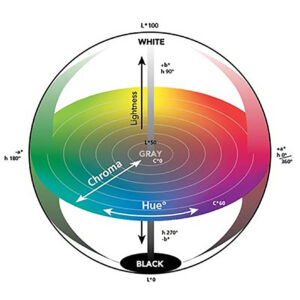
This color space often is pictured as a 2D cartesian coordinate system with the x axis representing the green-red opposition and the y axis representing the blue-yellow opposition. Both are useful for understanding what the relative color is but the tolerances in the CIE L*C*h0 more closely represents the differences the eye can perceive (Figure 2).
Color tolerancing
The ΔECMC is generally recognized as the most reliable tolerancing system. When viewing a color, the amount of variation in color (hue, chroma and lightness) before the change is just noticeable, it is not the same across all of color space. In most cases, the eye is most sensitive to changes in hue, then to chroma and finally to lightness. In CMC ΔE, color difference is represented by a single numerical value ΔECMC. The CMC calculations defines an ellipsoid around point in color space while the volume of the ellipsoid represents acceptable color variation.
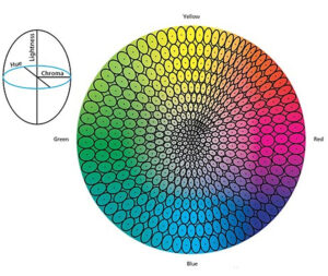
When defining the just noticeable difference around a point in color space, not all ellipsoids are the same size. In the green area of color space they are larger due to the eyes’ low sensitivity to shifts in hue in this region of color space. No color tolerancing system is perfect and colors are accepted or rejected because of the way they look rather than any numerical value. Typically, a ΔECMC < 1.0 is acceptable, but in some applications a ΔECMC of < 0.5 is too large. The final decision should be made by a visual match (Figure 3).
Light
Since color is the reflected light from a surface, it follows that if the light source is changed, the observed color can change. Common sources include day light, incandescent lights, fluorescent lights and light emitting diode (LED) lights. The electromagnetic spectrum of each source varies, so the amount of light that can be reflected at each wavelength varies when the light source is changed. This can result in a perceived color difference. Even with daylight, the spectral content changes depending upon the time of day, weather conditions and location.
LED sources offer a particular challenge since they are created using a mix of differing colored LEDs or by using blue LEDs and a phosphor. They also are sold at differing color temperatures (visible spectra), such a color temperature of 2700 K or 6400 K. These designations are the approximate color temperature of a black body emitter and, as such, do not entirely define the spectral content of the light.
If needed, a better way to characterize a source is to measure the spectral output using a spectroradiometer. It is important to know what environment the product will be viewed in so that the color is designed properly to get the desired appearance in all expected applications.
Color in decorated plastics
Color in plastic decorating is primarily created using pigments and dyes in combination with the carrier used to deliver them. When light interacts with a surface, some of it is absorbed, some is reflected and some is scattered. In general, the more light that is scattered the lower the gloss and the lighter the part will appear.
Other than with opaque straight shades, color gets more complex. When a coating or ink is translucent or too thin, some of the light passes through it and the color of the substrate influences the observed color. To prevent this read through, it is important to apply paints and inks in a thickness that is greater than the reported hiding power. It is always best to develop color matches using the technology that will be used in production.
Some colors, by their nature, are more complex. Anodized appearances, for example, can be achieved by painting a tinted translucent coating over an opaque metallic coating, so both layers contribute to the perceived color. The use of light interference pigments, opalescent pigments, fluorescent colors and metallics also complicate the measurement and characterization of a decorated surface.
Visual match
The best way to match colors is visually. To do that successfully requires a person who perceives color differences. Most are aware that some people, mostly men, are color blind (deficient). Many people with normal color vision do not have perfect color perception. The best available test to evaluate color perception is the Farnsworth Munsell 100 hue test. In this test, an observer arranges tiles in order by hue. The test is specified in ASTM E1499, Guide for Selection, Evaluation and Training of Observers. Only about 16% of people have superior color discrimination and should be making color decisions.
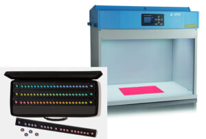
Next, the proper viewing environment and conditions are required. To compare color of a standard and the part, a standard light source is needed, and stray light must be excluded. Best practice is to use a calibrated light booth or overhead luminaires in a dark room. In making color decisions, viewing conditions also must be controlled. The background should be a neutral gray, containing only the parts being viewed, and bright-colored clothes and distractions should be avoided. More can be learned from standards such as ASTM D1729, SAE J361 and ISO 3668, as seen in Figure 4.
Also, it is possible to have metameric matches. Metamerism occurs when two objects match in color with one light source or set of viewing conditions, but do not match under another. For this reason, standards should be compared to the part using several standard light sources – CIE standard illuminant D65 and CIE standard illuminant A, for example.
For a number of reasons, it is possible within the same technology to have two surfaces that measure the same with instruments and look different or measure different and look the same. Because of this, it is important to use visual comparisons, rather than just relying on numerical data from instruments. A visual match is always the most reliable method.
Instruments
When color is measured with an instrument, the input is known as a spectral energy distribution of a source. The output is a spectral curve showing the amount of each energy reflected at each wavelength. Software then can convert the information, using a model of how the eye perceives color, into a value in one or more of the color spaces used to describe color. This shorthand output is useful in understanding where in color space this particular color exists. By comparing values, it also is possible to estimate if two parts will appear to be the same color or not.
The two most common optical configurations used in instrumental color measurement are the spectrometers using a d/8° integrating sphere and a spectrometer using a 45°/0° geometry. A third is a multi-angle spectrometer, which is primarily used to measure surfaces that include metallic or light interference pigments. Most straight shades can be characterized by the first two instruments.
The spectrometers using a d/8° integrating sphere in a specular included setting is best for color matching in like surfaces, color strength development, comparing results in durability testing and to generate spectral curves to check for metamerism.
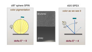
The spectrometers using a 45°/0° geometry (specular excluded) are good for batch-to-batch control and harmonizing materials and textures used in the same application. When communicating with customers or suppliers, it is critical that both parties use the same instrument, illuminant setting, observer setting and method of measurement (Figure 5).
Color matching
The process of developing a color should always start with a physical example or standard. Various companies and industries use differing standards. These standards can be printed on paper, painted coupons or actual parts. Pantone colors, RAL standards or company-specific standards, provided either by the customer or standards suppliers, such as Thierry, are typical sources.
The next step is the development of the materials and process required to make a visual match using the standard as reference. It is useful to use both an instrument and visual evaluation during the development phase. The spectrometer will give useful information on how close it is to the target and visual will confirm the match is correct. Finally, once the materials are set and processes are established, samples for customer approval need to be produced. It is best if sample plaques that can later be used as process control standards are produced at the same time.
Once serial production is started, regular color measurements should be made at the start, during and at the end the production runs and the results used for statistical process control. The 45°/0° geometry spectrometers work best when changes in both color and gloss are possible with the chosen process and material set. Standards used in production should always be stored in a dark, dry location at room temperature, and the measured surface should never be touched (finger oils can damage the standard).
Final thoughts
Color and the other aspects of appearance are complex and this is only a short introduction to reflected color in decorated plastics. Take the time to learn more and make sure the individual responsible for making color evaluations has superior color discrimination and knows how to properly evaluate color. Learn from groups like the Color and Appearance Division of SPE. Its conferences include day-long seminars that give a good basic understanding of color. Instrument manufacturers also have good webinars, training materials and reference books available.
Paul Uglum has 43 years of experience in various aspects of plastic materials, plastic decoration, joining and failure analysis. He owns Uglum Consulting, LLC, working in the areas of plastic decoration and optical bonding. For more information, send comments and questions to [email protected].


