


Anyone who has attempted to match spot colors when printing on colored substrates knows that the process presents various unique challenges. However, incorporating a few key suggestions can lead to great results. This article looks at why these challenges exist and how to approach overcoming them.
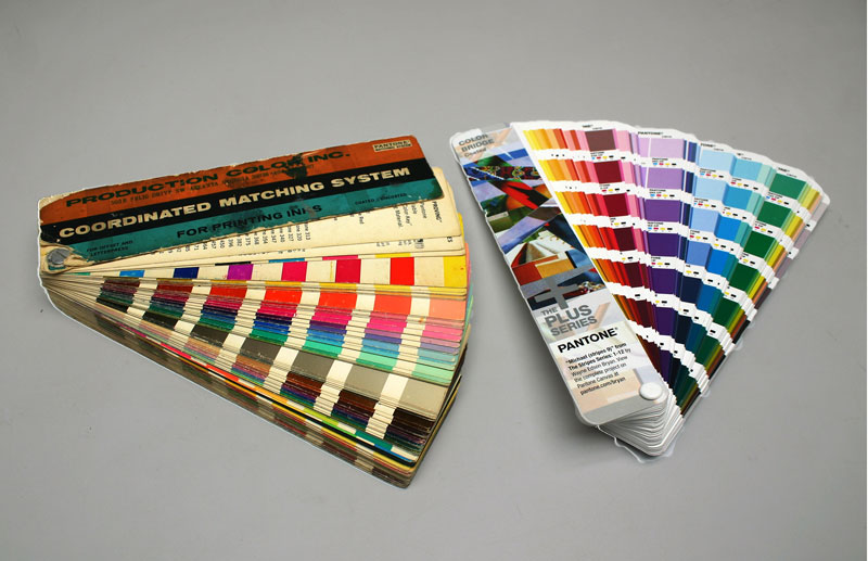
In today’s world it may be hard to imagine, but there was a time when a printer, asked to match a color, could only describe that color using descriptive terms like bright red, medium green or a commonly known color like “Coke red.” Then, in the early 1960s, the PANTONE company developed a color matching system that has been adopted by designers and printers. It took years for every printer and designer to acquire a PANTONE formulation book. Once they did, everyone had a numerical system to designate common spot colors, which now number 1,700 or more. For most printers, the challenge now is to match those colors.
Most printers use the PANTONE matching system when selecting and printing spot colors. A majority of the colors in the PANTONE formula guide are translucent, primarily due to the limited ink deposit achievable with off set lithography. This means a portion of the white paper substrate is always showing through the color, resulting in cleaner, brighter colors. Once the substrate being printed on is no longer white, printers must move away from translucent inks. In doing so, the clean, bright characteristics of the colors in the PANTONE guide may be lost.
The goal is to achieve similar appearance
The word “match” means, for one thing, to be equal or similar to another. For most printers, the expectation is for their printed color to be the same as the PANTONE color chip the customer has supplied. PANTONE books are similar to any other manufactured product, made to an acceptable tolerance. This means every book is not exactly the same, but it is reasonable to expect that the color in the printer’s book will be similar to the customer’s book.
It is important to understand how a PANTONE formula guide is produced. These books are printed by the off set lithography process on #1 grade 100# gloss text stock (for the coated books), and premium grade 80# text stock (for the uncoated books). The off set process applies one of the thinnest layers of ink in the printing world. This means the ink layer is thin enough – and therefore the color is translucent enough – that it is highly influenced by the paper it is printed upon.
One of the reasons PANTONE books undergo updates is changes to the paper used. The latest PANTONE guides state that the paper used will contain optical brighteners, appearing brighter under certain lighting conditions. The optical brighteners may have an influence on spectrophotometer readings of the paper and the color on it. Essentially, this means that, when trying to match a PANTONE color but not printing off set inks on paper, the goal should be to get something similar to the color – not an exact match. The differences in color will probably go beyond ink deposit if using screen, pad or inkjet printing. The vehicle, pigments and type of ink may be different, taking printers further away from achieving an exact match.
Measuring color with a spectrophotometer gives a mathematical indication of how close one color is to another color.
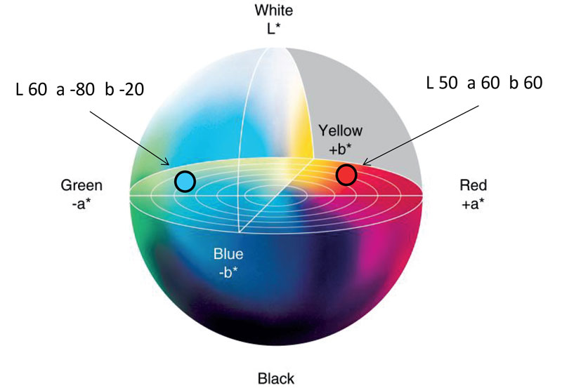
Spectrophotometers translate each color into a set of numbers, allowing for quantifying and comparing colors, even without the best color vision. Most color-matching departments use L*a*b* values to measure a color. This results in a set of three numbers that represent a color. In order to easily compare the values of the two colors, mathematical formulas are used to simplify them into a single number. This is the number of change (or delta) between the two and is commonly referred to as delta e.
There are four different mathematical formulas that can be used to produce these delta e numbers. Unfortunately, while a person may specify that two colors must be within a delta e of two or less for it to be considered a match, they will rarely specify which specific formula should be used to determine these values. This would be similar to being told to store beer at 40 degrees – without mentioning Celsius or Fahrenheit. In the same way 40 degrees Fahrenheit is preferable for the beer, CIE 2000 is preferable as the best method for calculating delta e.
Veteran color matchers will say that some colors measure very close numerically with an expensive spectrophotometer, yet do not appear similar visually, and vice versa. There are other factors that influence color appearance. The spectrophotometer sees a color through a tiny round window with none of the outside influences that occur when observing a color. Slight differences in a color are seen due to overall differences in texture and gloss, as well as the influence of surrounding colors that most instruments do not see. It also does not include any individual color perception biases, which may be an asset or a hinderance.
Spot colors are simulated in two primary methods
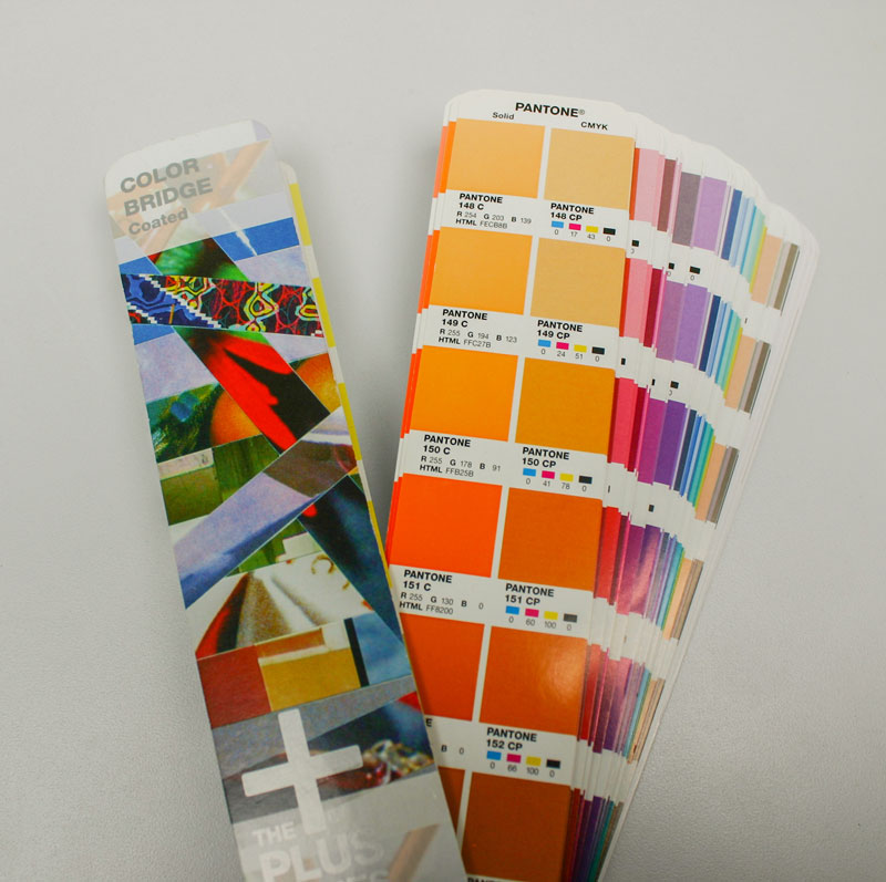
For most printing processes, spot colors are made in one of two ways. One is to mix up a color from separate ink components that are printed as one color. The other option is to simulate a PANTONE color as a build from percentages of CMYK inks. The first method allows for the most accurate simulation, as there is usually a wider range of colored components available to make up the color. This is how the PANTONE formula guide colors are made.
Simulating a spot color from CMYK inks as a build can be limiting – there is only so much four colors can do. This method only allows a close simulation of 50% to 60% of the PANTONE formula guide. These limitations are easy to observe when using the PANTONE bridge book, which offers a mixed ink PANTONE spot color printed side by side with the closest CMYK build of that color. This limitation in printing the full range of PANTONE colors with CMYK inks can be improved by using the hexachrome set of process colors, which adds a process orange and green to extend the CMYK gamut. Using this method allows for simulation of up to 90% of PANTONE colors.
Using CMYK inks as a build to simulate PANTONE colors on non-white substrates is only an option if white can be printed under the color. As part of the subtractive color system, CMYK inks are designed to be transparent and very specific in color, subtracting light reflecting off of the white substrate to create a full gamut using only four colors. As such, they must be printed on a white substrate or a layer of white ink to subtract the color from the white color beneath reflecting back to the observer.
Simulating spot colors on non-white substrates
Most spot color matching systems are built around a set of 12 to 16 colors that are designed to simulate the cleanest and brightest spot colors and, therefore, need to be printed on a white substrate or layer of white ink. Unfortunately, this is not always an option. If the spot color cannot be printed on top of white, the next step is to increase the ink deposit or opacity. This is analogous to applying another layer of paint to the wall in a house to cover up a previous color. However, printing two layers of the same color is not a common practice.
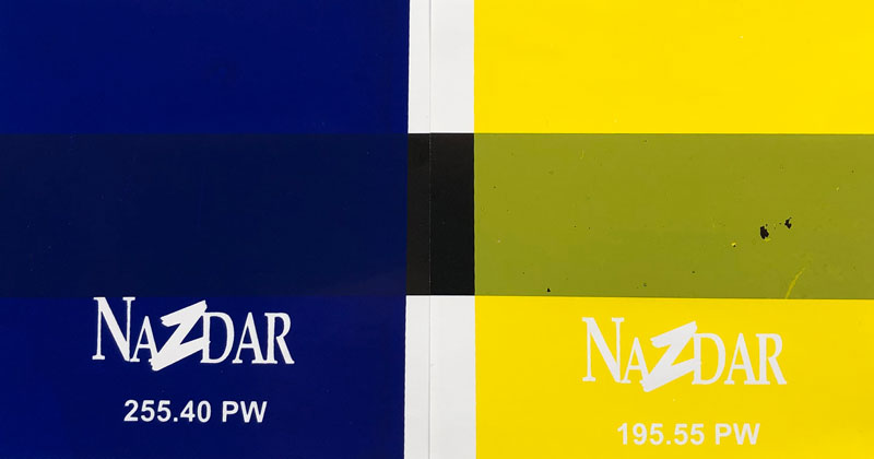
More commonly, the inks or the ink deposit are modified to create a more opaque ink layer. This can be as simple as using other colors in a particular ink system that are not part of the mixing system colors, used because they are designed to be more opaque. An example would be to use Fire Red instead of PANTONE Warm Red or Lemon Yellow instead of PANTONE Yellow in a color match.
Another option is to have a special color matched that is more opaque. This could require having a special color match made by the ink manufacturer with additional pigment or other opacifiers added to the ink. This is very common in the screen, pad and flexo print processes. Though beneficial, these changes can result in some compromises in ink performance, appearance or even cost, illustrating why a balanced approach must be taken when creating special color matches.
When it comes to doing color matches on colored substrates, it is best to know which colors in the ink system are the most opaque to be used as components in opaque color matches. A simple way to rate the opacity of colors is to perform drawdowns of all the colors in an ink system on Leneta cards that have black and white printing areas on them. After taking a measurement of the color on white as the standard, a comparison measurement of the color over black is made to get a delta e reading. The lower the delta e number, the more opaque the ink.
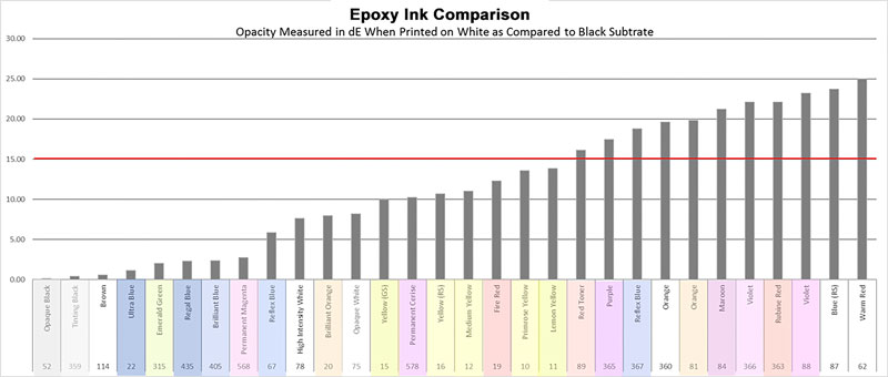
Once that has been done, it is possible to rate all color components on an opacity basis, so when matching colors on colored substrates printers know which colors will combine to give the most opaque color match. Once this work has been done, printers may find there is one area in the color spectrum without enough opacity to be consistent with the other colors.
It would then make sense to have a special, highly pigmented color made to fill that color gap. This is often a red, orange or yellow ink. Modifying these particular colors usually results in higher cost inks.
It is generally true that using more opaque inks will result in less clean and vibrant colors. That is mainly evident when the color is printed on a white substrate. When an opaque color is printed on a colored substrate, it may very well appear clean and bright due to the contrast the eye perceives between the color and the background it is printed on. A yellow ink that prints on a blue plastic and still looks yellow won’t look all that bright and clean if printed on white plastic. Once printers move away from white paper, the goal is to simulate, not to match.
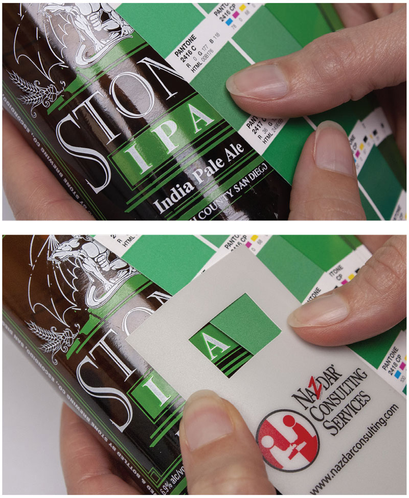
When it comes to simulating any color on a colored substrate, it is always best to provide press proofs or lab proofs if time will allow. Digital and soft proofing cannot simulate the true effect of one color on top of another.
Even the common ink drawdown can be misleading as to how well the ink will cover a colored substrate. This is especially true when the final print will be type or fine lines making up an image. The large drawdown will always appear less opaque. It is best to use color isolators to view just a smaller portion of the color and the colored substrate to predict how the final image will appear.
There are many ways to simulate a spot color on a colored substrate. The best first step is to be sure to use the most opaque inks in a current ink system instead of using the colors designated as PANTONE matching colors. The second is to view the color isolated from the surrounding background that may have a negative influence on the color when comparing to any target color that is printed on white paper. The next step is to modify an ink with additives, if available, that will help the ink appear more opaque.
If these steps are not providing acceptable results, there is always a possibility that an ink supplier can make a special color match that may incorporate more pigment or other powders to improve the ink’s opacity. This may require milling or grinding the pigment into the ink. Many ink manufacturers can make use of opacifiers, flattening agents and powders that can be mixed into an ink to create diffusion of light, which appears as more opacity. Note: These modifications require the re-evaluation of adhesion and finishing characteristics, which may be compromised when adding more powders to an ink.
Customized products create special results
Screen printing legend Richard Greaves once said that the guy that wins the race is the guy that has modified his car more than the other racers. Otherwise his performance would be just like all the other racers. This is true when wanting to do out-of-the-ordinary printing. Consider how to modify the process and the products used to get the best results.
Bruce Ridge is the director of technical services at Nazdar Ink Technologies, where they manufacture inks for the inkjet, screen, flexo and pad printing processes. Nazdar Ink Technologies is a specialty ink manufacturer with extensive color matching and technical support departments. Ridge is a member of the Academy of Screen and Digital Printing Technologies. For more information, send comments and questions to bridge@nazdar.com.
 Bruce Ridge
director of technical service
Nazdar Ink Technologies